flyjobs.ai
After effectively fulfilling their job posting needs, FlyHigh Talent felt motivated to pursue further opportunities. They envisioned a system that would serve both employers and candidates, recognizing the potential of AI. Unanimously, the shareholders committed to developing a pioneering product leveraging AI to efficiently match jobs, revolutionizing the traditional headhunting process.
Cross Function Team
PM
Researcher
Contract Designer
Engineering
My Role:
Branding
Design System
Marketing Designer
Problem Statement
Job seekers and recruiters need a user-friendly platform that leverages AI to streamline the job search process and candidate screening to reduce the time and effort required for job seekers to find suitable positions and for recruiters to identify qualified candidates, ultimately improving the efficiency of the job market ecosystem.


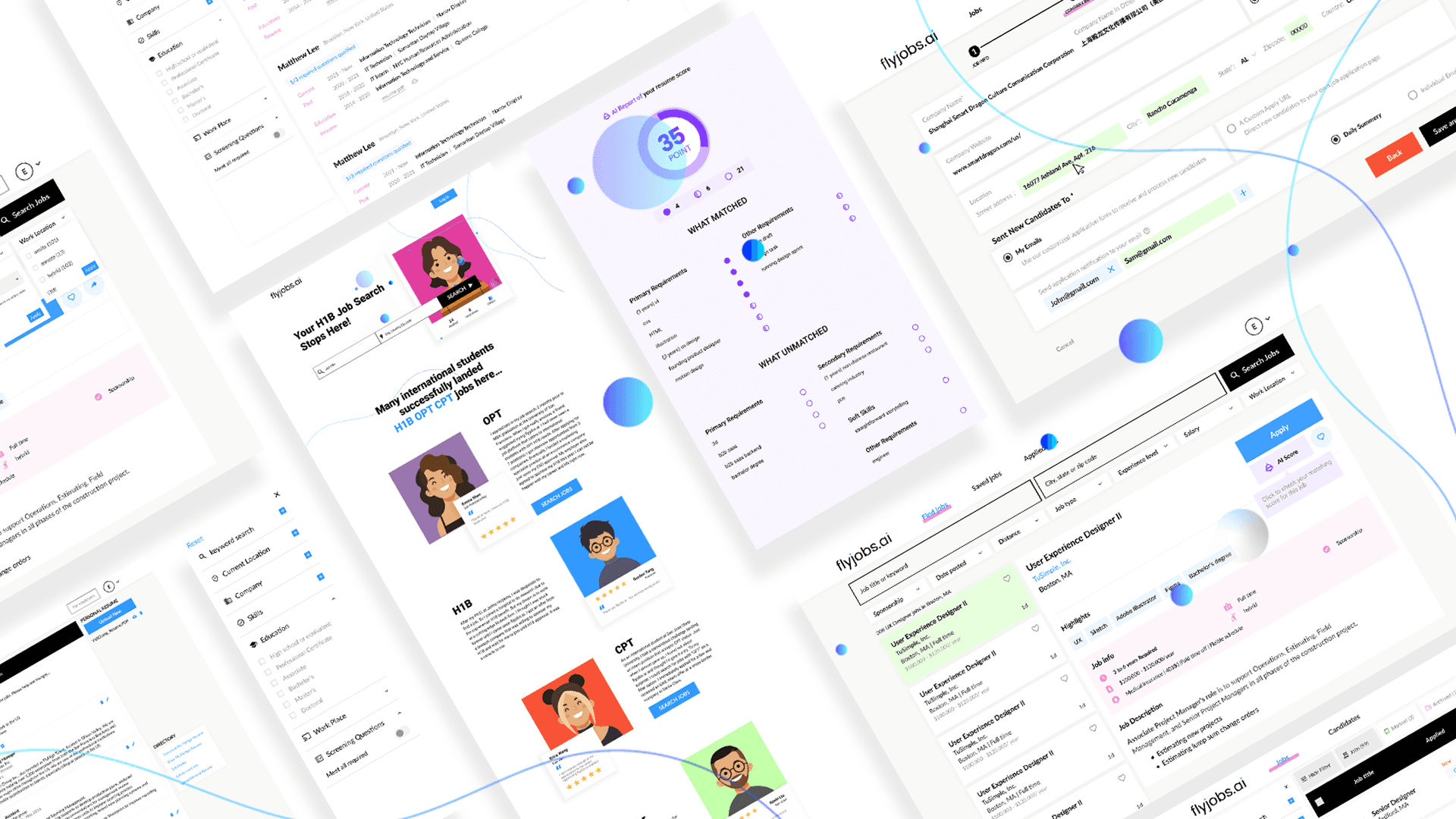
Branding & Visual Design
Our project shareholders think it is critical for us to establish a definitive design direction and set the tone appropriately because, initially, our project prioritized on some research rather than focusing on the visual.
Problem
We encountered a challenge where the 1st draft appeared overly simplistic and heavily influenced by LinkedIn and Indeed. Crafted polished visual designs to impress investors is needed.
Logo

Favicon

Color Pattern

Font Family
Lato
ABCDEFGHIJKLMNOPQRSTUVWXYZ
abcdefghijklmnopqrstuvwxyz
1234567890,.!"?{}[]()@#$%&


Job Seeker main page
New users had a hard time differing where is the filters and where are the job cards because our main objective was to craft a prototype that would impress investors with the product's remarkable AI capabilities, and we spent less time on mobile version layout.
This oversight resulted in significant visibility issues when users accessed the product on their mobile devices.


Option 1
Pros:
Keep consistency with the desktop version
The design approach makes front-end development easier, saving valuable time and effort during the implementation phase.
Cons:
Cost too much space, not enough space for job cards
Option 2
Pros:
The thinner search bar saves space, allowing for a more streamlined and compact design.
The hide filter feature maximizes available space.
The bold strokes enhances the visual appeal, made the job cards stand out, especially on mobile devices.
Cons:
Deviation from the original design may requiring familiarization with the new style.
AI job matching module

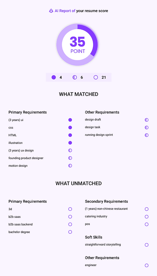
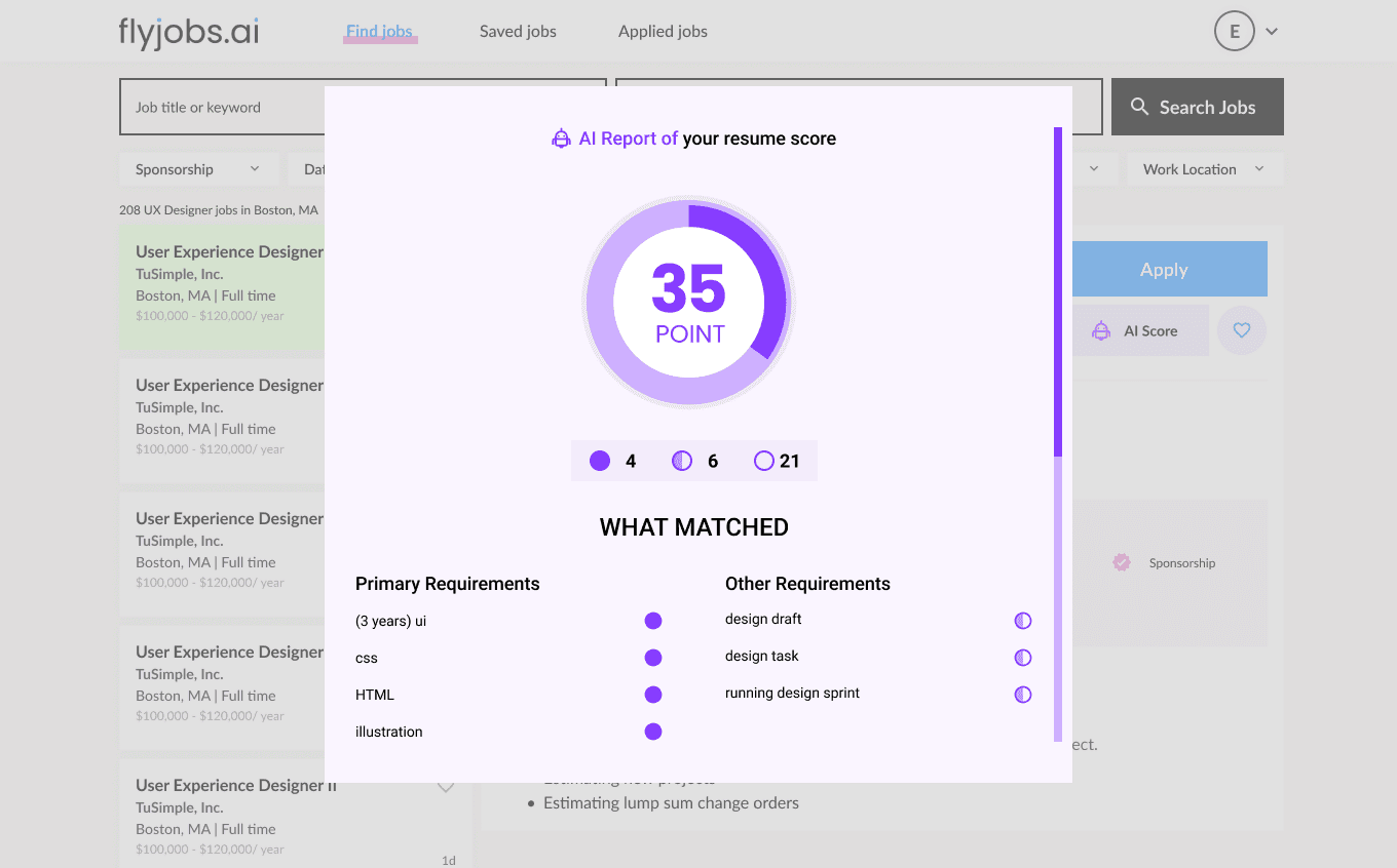
This was an example from a rapid design prototype. Apparently, this progress bar doesn't fit in mobile.
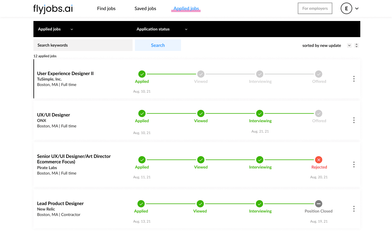
Candidate Needs:
Check application state *
Sort application by state or date
Withdraw or archive applications


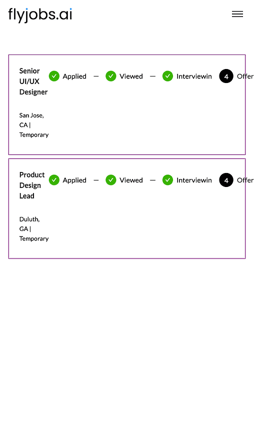
Option 1
Pros:
Save space for more job cards
Cons:
Only display the candidate's current application state
Option 2
Pros:
Candidates can still understand where are they in the hiring pipeline
Cons:
Uses a little bit more space


